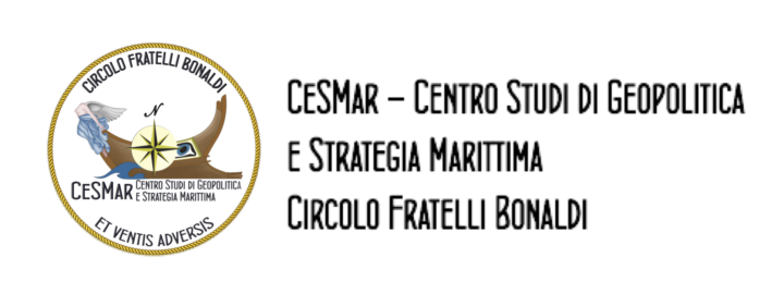
Logo and motto
25 October 2022 2025-08-09 17:20Logo and motto
The logo represents the image of the club itself. Several symbolic elements are described below, starting from the center, as the “focus”.

The wind rose
Element that unequivocally belongs to the naval sector; it is one of the few key elements recognized by the “sailor”. This wind rose is also embellished with a circle, that intend to define the area (the maritime club) within which the “Circolo Fratelli Bonaldi” intends to operate by uniting all the experts and enthusiasts about the sea. In particular, we wanted to give visual importance to a cardinal point of the rose: the North which is linked to the meaning of the Polar star.
At the top
the writing reminds us the name Circolo Fratelli Bonaldi, a place for sharing virtues. Some of the prominent personalities were born and raised in the most remote mountains of the national territory, from those of Savoy to those of Veneto, border and conflict regions, where to be Italians was a choice. It was right and important to remember, especially for a Study Center, figures who have distinguished themselves for their service vocation. The Club was born in Vittorio Veneto and, before looking at wider horizons, the figure of the two Bonaldi brothers was taken as a reference because it seemed logical and fundamental to refer to characters linked to the symbol City of the 1st GM and to the Navy, emblematic figures of a family that, also as a convergence of the different and best values of the country, has served the country for well over a century, from the Risorgimento to the Republic. The Bonaldis represent a family cemented by different values, such as the Venetian blood of the father and the Ligurian blood of the mother, the Garibaldian irredentism of the father, protagonist of emigration and lucky entrepreneur in the new world, expression of the American melting pot that brings back successes and experiences and instills in the children the responsibility (ethics) as a reference value. Both brothers were naval officers, one teacher and governor of Prince Umberto, the other a brave fighter and liberator of Fiume, leaving an important memory of himself. Figures of reference, who without excess and with the vocation of silence and service that has always distinguished the Navy, testify the role of the Navy in the Italian history.
At the bottom
the writing indicates the motto “Et Ventis Adversis”. The motto implies a link with the best known motto of the Italian Navy tradition “Memento audere semper, et ventis adversis” as it was joined to it with the meaning of “Remember to always dare, even with headwinds”. Other possibility is the link to “Donec ad metam, et Ventis Adversis” whose translation is: “Up to the goal even with headwinds”. It is said that the motto Et Ventis Adversis was coined by D’Annunzio in 1915 while embarking on board in war action in the Upper Adriatic. The motto links together the figure of D’Annunzio to the epic of the MAS, of which Silvio Bonaldi was one of the protagonists. The profound meaning of the motto lies in the link with the Navy and in the role of CeSMar to support it in difficult situations.
The acronym CeSmar
At the bottom, positioned on the keel of the two stylized ships, the acronym CeSmar; note, in this regard, the proportion between the two writings: CeSMar has a larger font because the eye must “fall” on it and, only later, on the written alongside which explains the meaning of the acronym.
The wave
placed in a dominant position with respect to the acronym CeSMar recalls the importance of the sea and its guiding role in the management of the Club, the element that unites all the members of the Club. CeSMar’s task will always and in any case be able to provide valuable output in the maritime field
The prow of the Roman trireme
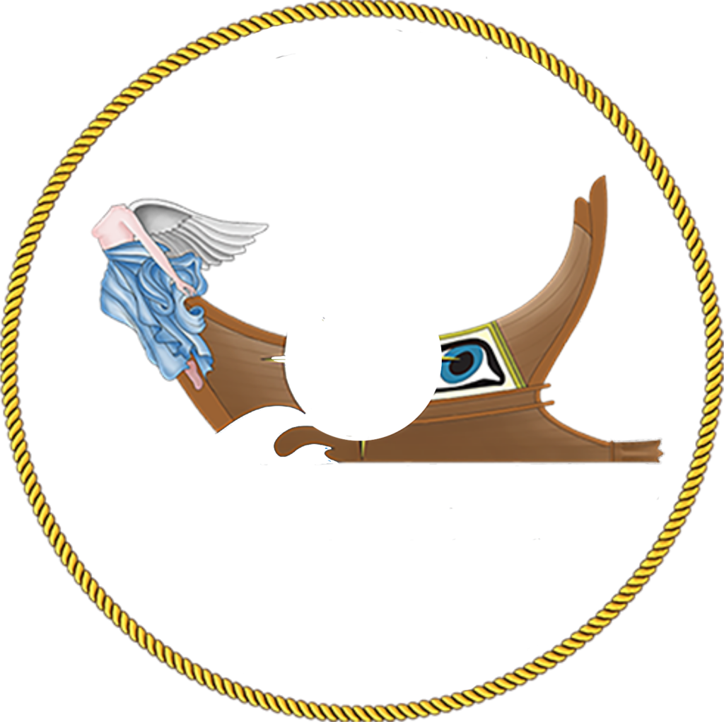
The prow of the Roman trireme (on the right) and of the “Venetian cocca”, with the figurehead of the nike of the victory (on the left). The bows of the two ships symbolize the two most important and significant powers linked to the sea that, over the centuries, Italy has been able to express: that of a naval power state such as Rome and that of a maritime power state such as the Serenissima. The two bows also represent the two souls of the Club, that of Rome, the city chosen as an operational base, and that of the Veneto region where CeSMar is located. The two bows then recall the two elements of maritime power, the naval power linked to the Navy and the merchant one linked to the economy and trade. The original nike represents the link with the city of Victory, where the Club was born and has its registered office. The apotropaic eye of the Roman trireme removes defeat and misfortune, but above all recalls and invites the ability to observe events objectively by investigating in depth in the study of maritime themes, without conditioning.
